Corporate Identity for a Berlin Based Studio
Corporate Identity & Photography
Based on interviews with almost all team members of Lucid.Studio, a branding pyramid was developed. The unique qualities of Lucid.Studio were translated into a visual language.
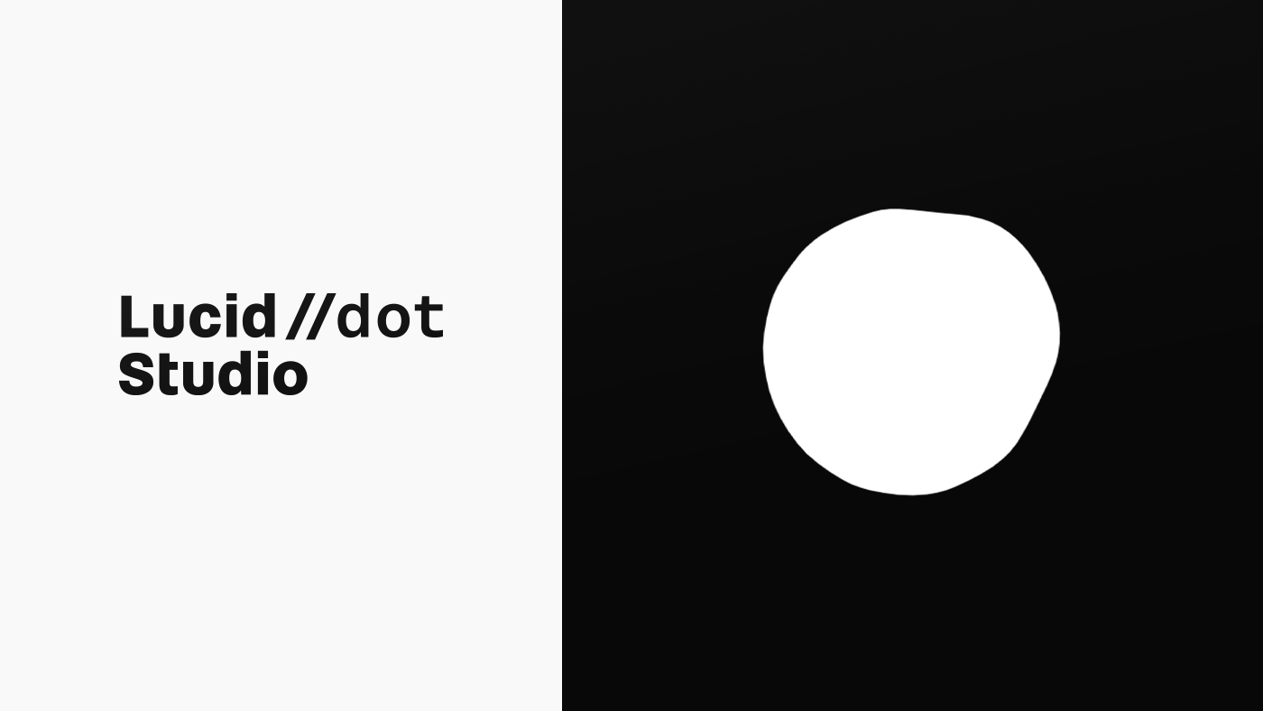
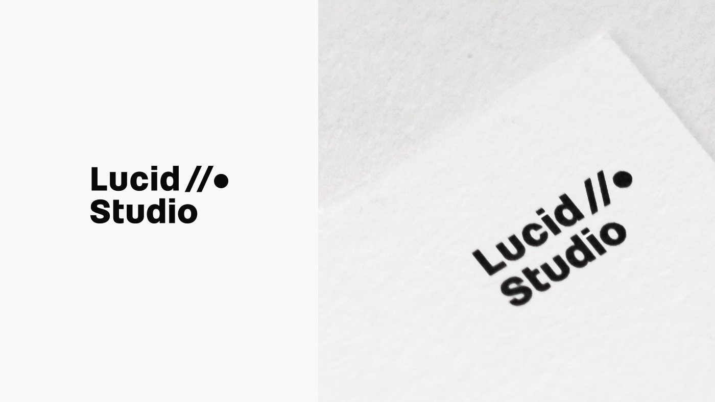
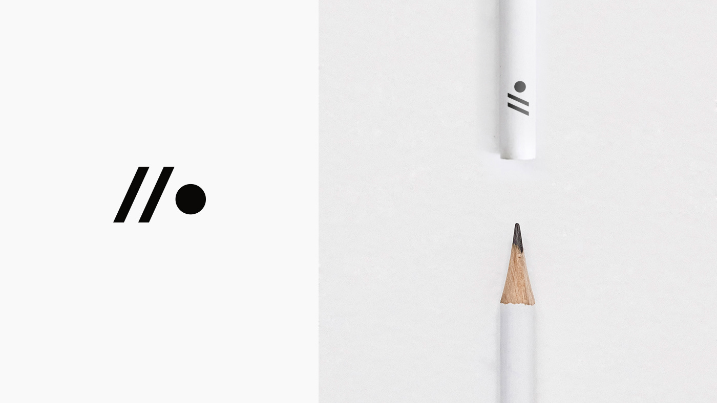
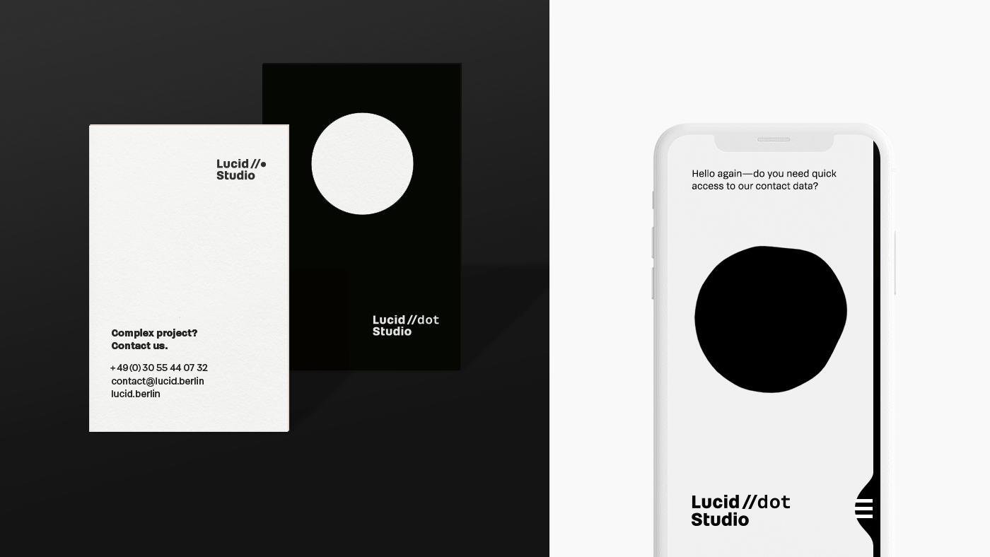
During research phase, it was found that the unique selling points of Lucid.Studio are all characteristics of water. This fact made water the leading symbol of the CI development. It is clearly visible at the »dot«, which appears as a connecting element between Lucid and Studio, but also plays an important role in the signet. In digital applications, the dot is animated. Linguistically, it brings the recipient immediately into a technical world. This is underlined in the signet by the double-slash, set in front of the dot. It is borrowed from the programming language and comments out remarks.
The Font Brenner is used, to convey the clarity that is important in all of Lucid’s projects. For the same reason, the decision was made to renounce colors and to work in a clear black and white scheme. In the design of all CI elements, it was important to avoid decorative elements and to exert clarity through.
In the last step, a friendly picture style was developed to give the communication tools of Lucid.Studio a human and inviting face. It was applied on the office and team photos.